My Role: UX Designer / PM: Carrie Samples
Background
Have you ever seen a popup asking you to add a protection plan when you buy items?
Maybe you are the person who never buys such protection plans or warranties, or you might be a fan of purchasing protection plans ensuring keeping your items' value. Let's think about the user scenario below.
Maybe you are the person who never buys such protection plans or warranties, or you might be a fan of purchasing protection plans ensuring keeping your items' value. Let's think about the user scenario below.
User scenario:
Where you're purchasing a brand-new freezer. As you proceed through the checkout process, an alert pops up, offering you the option to purchase a protection plan for added security. You decide to decline the offer at that moment, thinking that purchasing protection plans sounds cool, but it would be over the budget.
Where you're purchasing a brand-new freezer. As you proceed through the checkout process, an alert pops up, offering you the option to purchase a protection plan for added security. You decide to decline the offer at that moment, thinking that purchasing protection plans sounds cool, but it would be over the budget.
While waiting for the delivery, a sudden worry creeps into your mind, and you have some extra budget for the protection plan. Now, you are thinking that you need a protection plan.
What should you do? How to achieve your goal?
What should you do? How to achieve your goal?
The post-purchase protection plan experience provides options to purchase when users encounter a situation like this.
In the past, Home Depot had limited the option to buy protection plans only while purchasing an item. This meant that if a user declined the offer and bought only the main item they intended to purchase, there was no way to add a protection plan later on, even in unforeseen circumstances.
Research
Through user research, the team realized that even when users wanted to purchase a protection plan, they were often unable or hesitant to do so because it was out of their budget, and if they were unable to purchase a protection plan, they wanted to purchase it later.
For this reason, the business decided to add an 'add protection plan' button on the Order History page for the single general merchandise items, increasing the revenue.
When I joined the team, the team had been working without UX support for months and started the post-purchase experience part.
Problem Statement
"How might we create a post-purchase protection plan experience
that has intuitive UIs, and streamlined user flow so that
that has intuitive UIs, and streamlined user flow so that
customers can easily access and use the benefits of the plans without any confusion between the purchase and the post-purchase experience?"
Challenge
The same purpose, two different user flows
Even if the purpose of a customer purchasing a protection plan is the same, the interaction and how the system understands it is entirely different depending on the stage during or after the purchase.
The HDPP's during-purchase and post-purchase experiences have different flows since the system treats HDPP differently depending on phases. If a customer buys HDPP in the during-purchase stage, the HDPP will be treated as an option attached to the anchor item, and if it is in the post-purchase phase, the system will treat the HDPP as an individual item.
The same post-purchase experience, two different starting points, and two different interactions
Also, the HDPP post-purchase experience can start from two points: The Thank you page and the Order Details page, and its user flows are slightly different depending on the page's purpose.
Two types of items: General Merchandise(GM) and Major Appliance(MA) items
The HDPP experience can be categorized into two sections which are General Merchandise(GM) and Major Appliances(MA.) The system treats them differently, and also the user flows for both categories were totally different.
Two Design Systems
It was a transitional moment the Home Depot was adopting a new design system.
The HDPP projects needed design system components but were not yet fully set.
The HDPP projects needed design system components but were not yet fully set.
Solution
1/ Created the multi-component system with variants for rapid prototyping - which not only saved time but also ensured adherence to the company's design system.
2/ Created a flowchart to see the whole flow from the bird's eye view
Due to the complex user flows and the number of cases with the team, I decided to create the flowchart to see the whole flow from a bird view. I started from the post-purchase experience section and eventually, I finished the whole flow from start to end. The flowchart really helped my work, especially collaborating with other teams and communicating with stakeholders.
3/ Used intuitive naming convention for the Dev team and other designers
4/ Collaborated along with constant communication with other related teams and the dev team - the flow chart I created helped communicate with them
Process
The First Solution
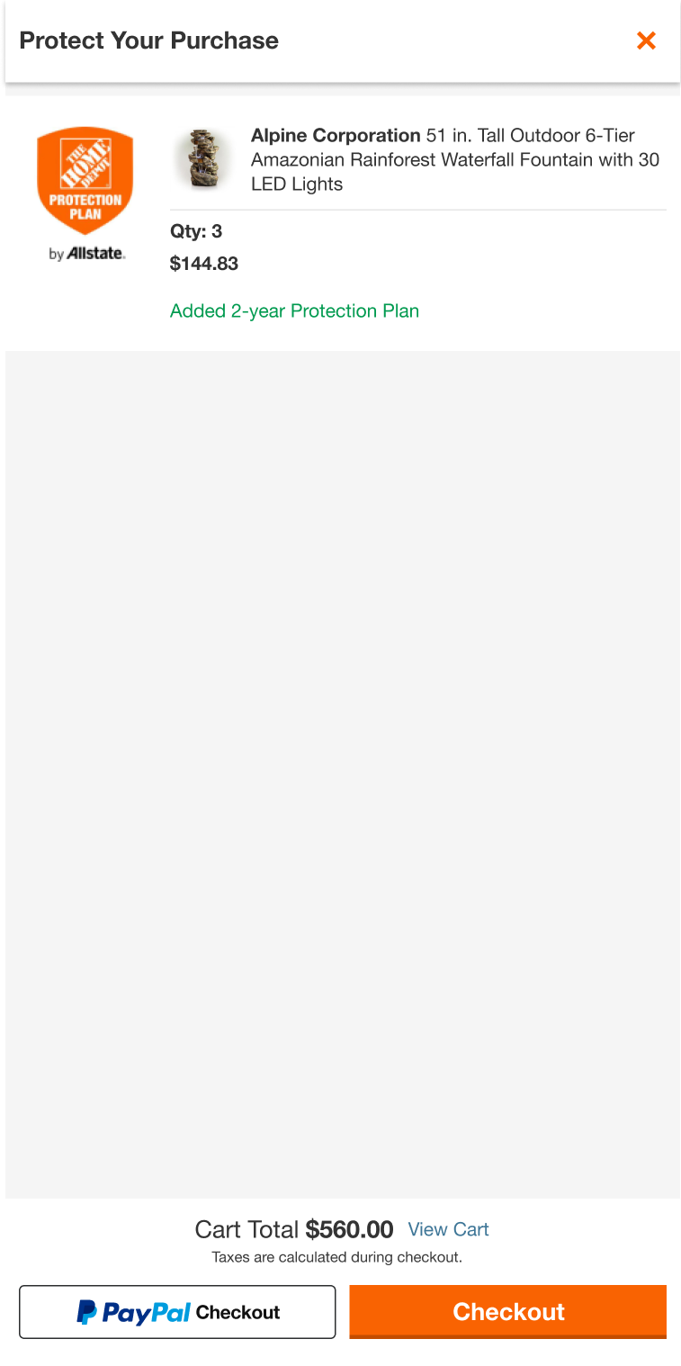
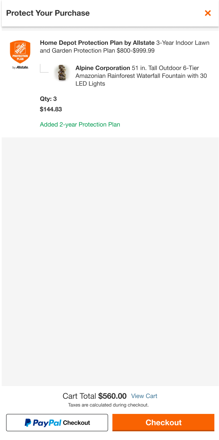
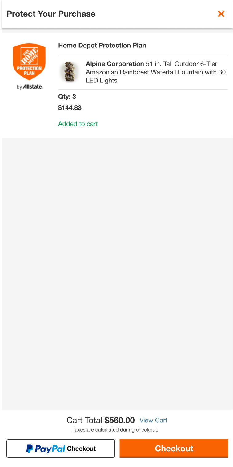
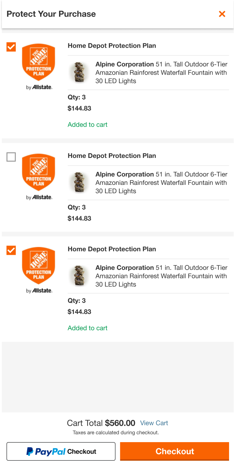
My first task was to review UI design for general merchandise(GM) items the dev team was about to launch. The dev team added some functionalities within the current design, but the PM and the design manager wanted a design showing the relationship between the protection plan and the anchor item. In a week, I made 3 options, and we picked the final design.
Everyone liked it and the new design met the requirements.
Everyone liked it and the new design met the requirements.
But I failed
The design was perfectly working for the GM items. But it was not working for other situations: MA single, MA multi, and GM/MA mixed item drawer.
Why?
The design and the user flow should've considered the 5 different situations. And I wanted to find out why I failed. To find the solution for the situation, I did the Post Mortem - 5 whys activity.
Solution for the problem
To tackle the complexities of various user flows and cases in our team, I came up with a solution. I created a detailed flowchart that provided a bird's eye view of the entire process. Beginning with the post-purchase experience section, I worked my way through the entire flowchart, from start to finish. The flowchart was an incredibly useful tool, not just for my team's work but also when working alongside other teams and meeting with stakeholders.
Collaboration and communication with other teams & Consistency
GM multi-item interactions seemed fine. It was easy to add and remove items using the checkboxes, and the green label that said 'Protection Plan Added' was intuitive.
However, interacting with the Major Appliances (MA) item with 2 options was a completely different story: the checkbox in the top left looked cluttered with 2 radio buttons, and we had to have a lot of conversations about whether or not to add a 'reject' radio button.
Also, on the product listing page and product detail page, customers use CTA buttons to add products, so the interaction of using a checkbox to add a product was not a common interaction.
After much discussion, the team agreed to use the CTA button for consistency across the entire website.
Iterations and New Design System
Since then, I've gone through countless design iterations between the ideation and prototype phases. Also, it required many meetings with other designers and teams at Home Depot.
By the time the design was almost organized, the team wanted to adopt the new design system, which was also a new challenge because the design system was not yet completed, and there was no example for the drawers using the new design system.
By the time the design was almost organized, the team wanted to adopt the new design system, which was also a new challenge because the design system was not yet completed, and there was no example for the drawers using the new design system.
The new design system, Stencil, required us to use the Auto-layout feature in Figma, and it also required a lot of design review with the Ops team. But as a designer who loves the Auto-Layout feature in Figma, it was a so fun process and even the new design system made my process faster.
Prototype
User Testing
The simplified Home Depot Protection Plan Post-Purchase drawer has been user-tested and proven to be user-friendly. After that, I finalized the design comps and delivered them to the Dev team.
Dev Handoff and Reviews
During a transitional phase of implementing the new design system, I encountered challenges where certain design assets I created were not being implemented correctly by the development team. To address this issue, I took the initiative to redline the designs meticulously, providing detailed annotations for typography, spacing, and other crucial elements. Additionally, I went a step further by creating two different final comps within two different design systems to assist the development team in effectively implementing the designs given the circumstances.
Reflection
I received Home Depot Design Team's "CAUGHT ORANGE HANDED" award from my senior manager Maggie Bruns and director Kristina Bosland
I successfully adopted a new design system and completed Ops reviews faster than other teams, making our team among the first to do so. The use of a multi-component system and flowchart were key factors that contributed to this success. These tools helped me to design and prototype quickly, iterate rapidly, and collaborate effectively with other teams and stakeholders. By visualizing the user flow, our team was able to make a consensus for design consistency.
Although I left the company before the final product was published, user testing showed that the product was well received by users. Feedback indicated that the interaction was easier than expected, which is a positive indicator that the design successfully met user needs and expectations.
I am proud of the work that my team and I accomplished and confident that the final product, based on the user testing feedback, will be a success and provide value to users.
